CLIENTE CLIENT
DESMET
ENQUADRAMENTO WORK
Rebranding
Rebranding
DESAFIO CHALLENGE
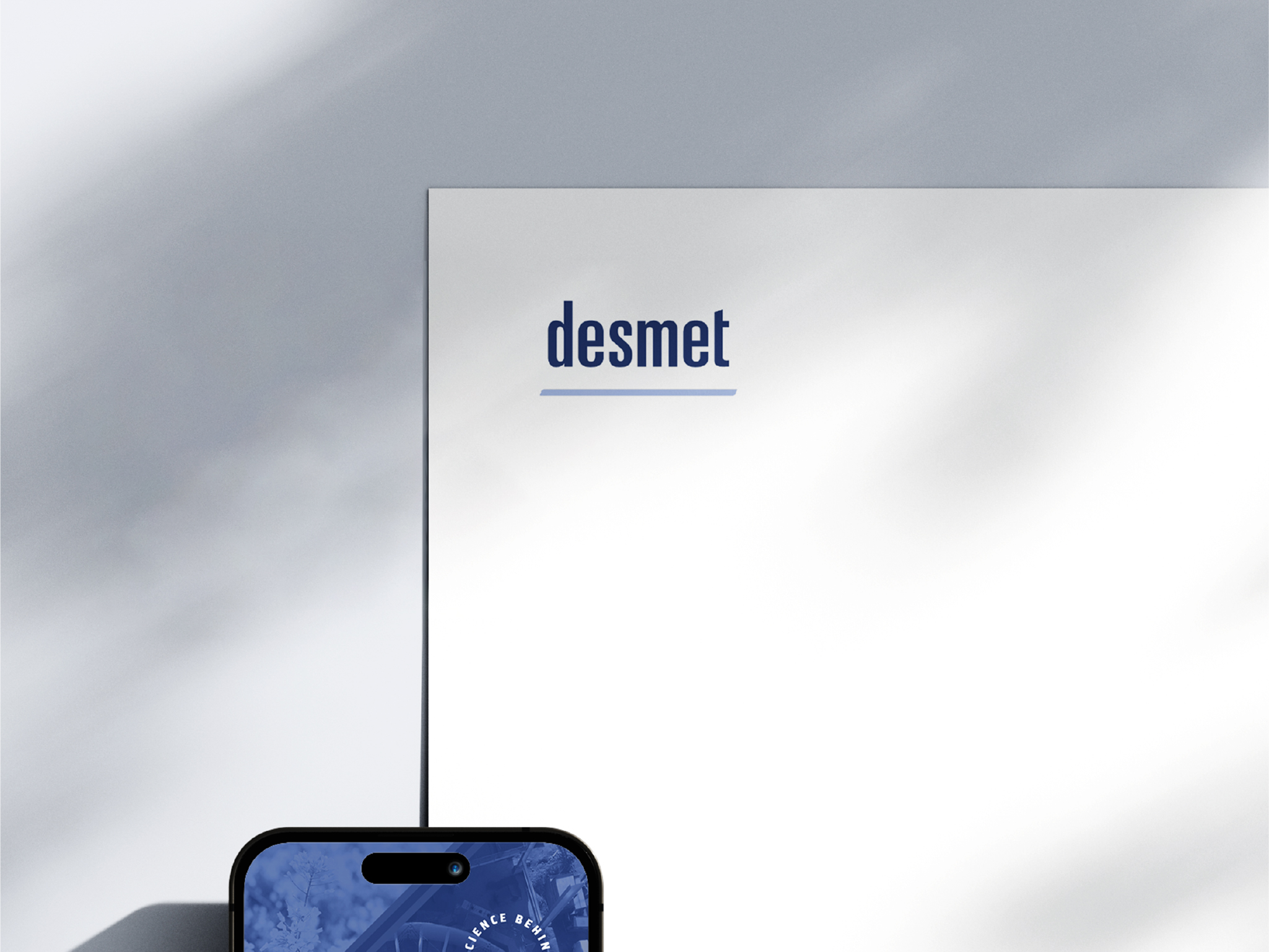
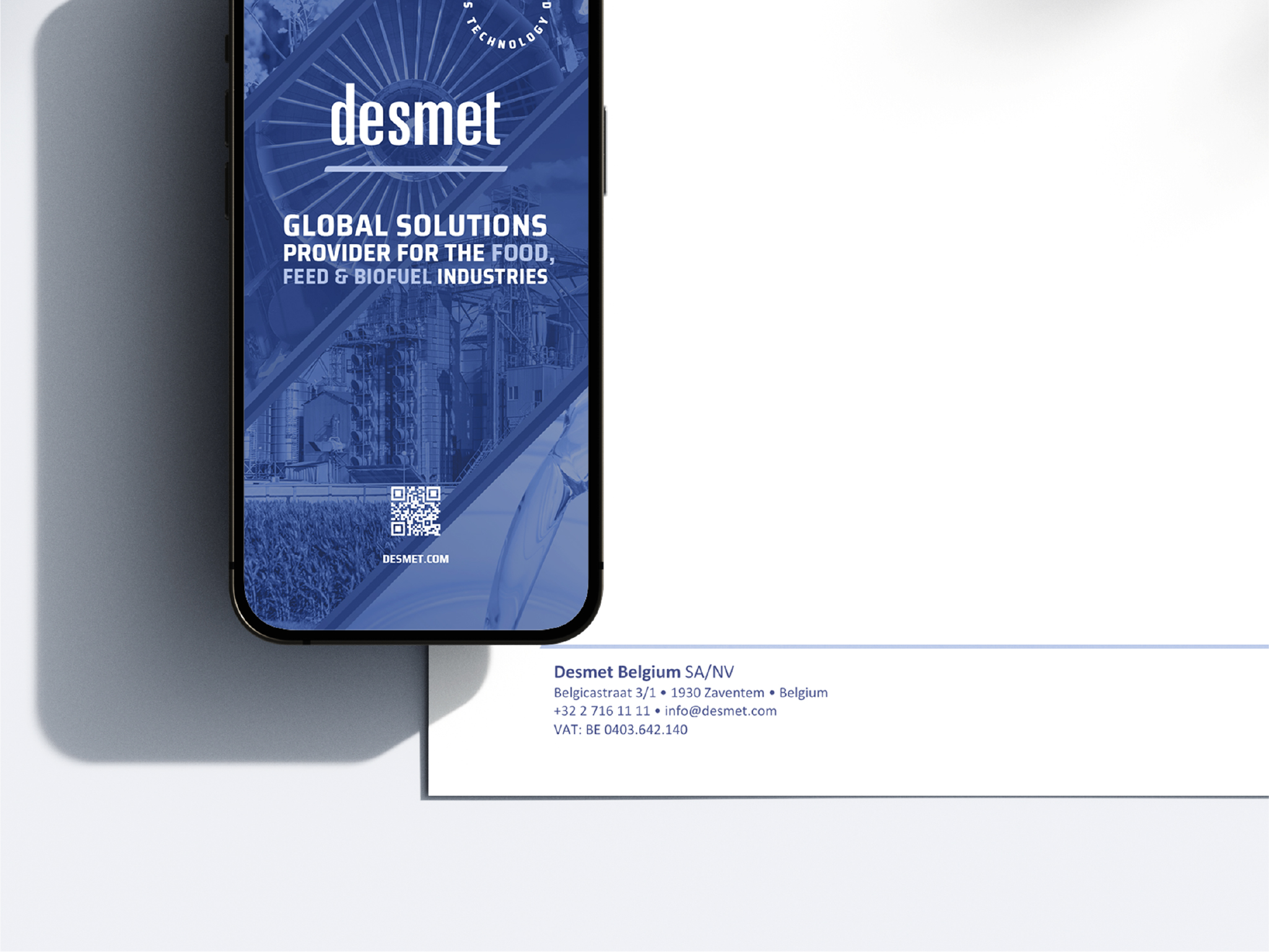
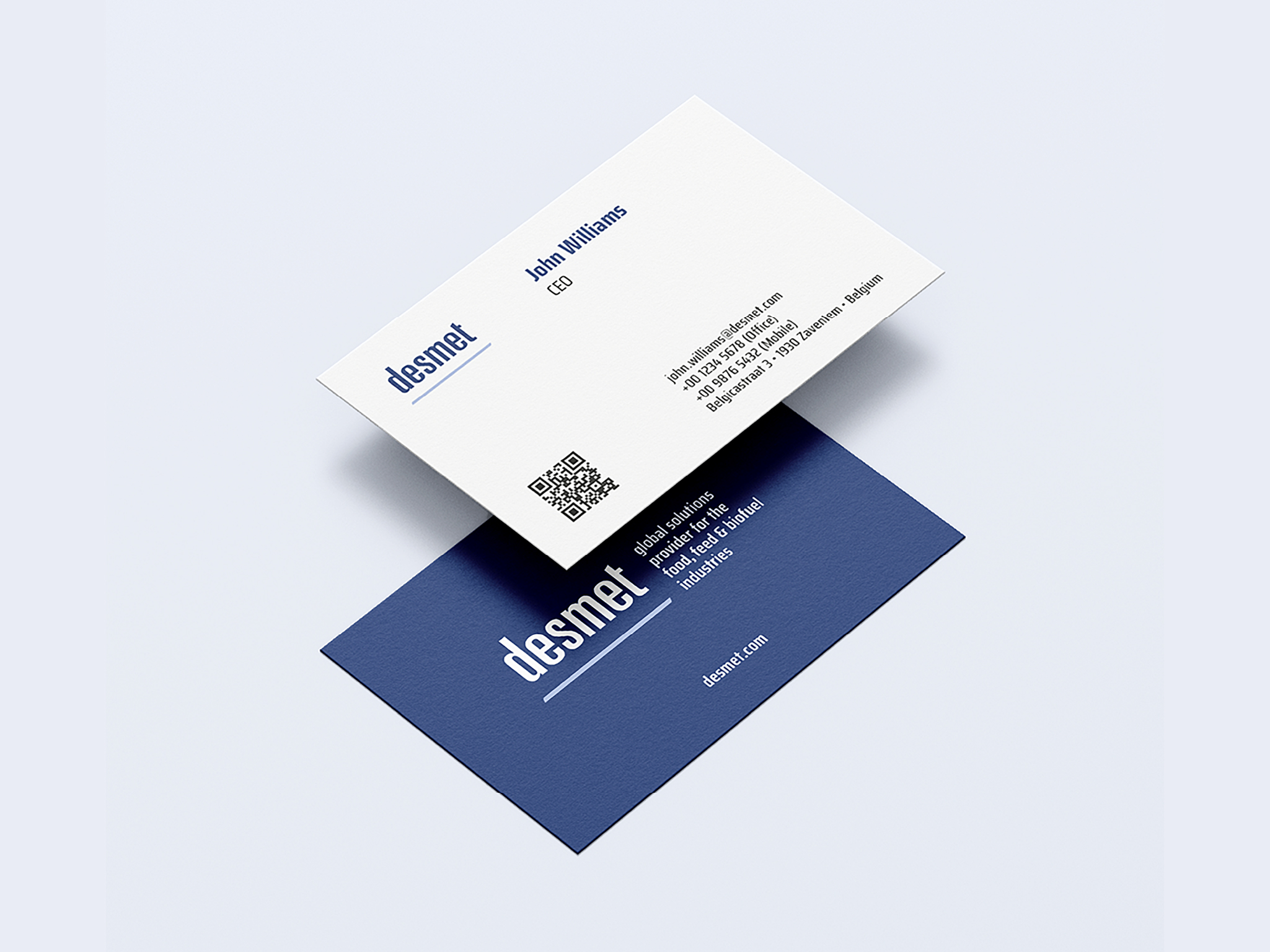
Rebranding – Identidade Visual + Estacionário + Brochuras
Rebranding – Visual Identity + Stationery + Brochures
A NOSSA PROPOSTA OUR PROPOSAL
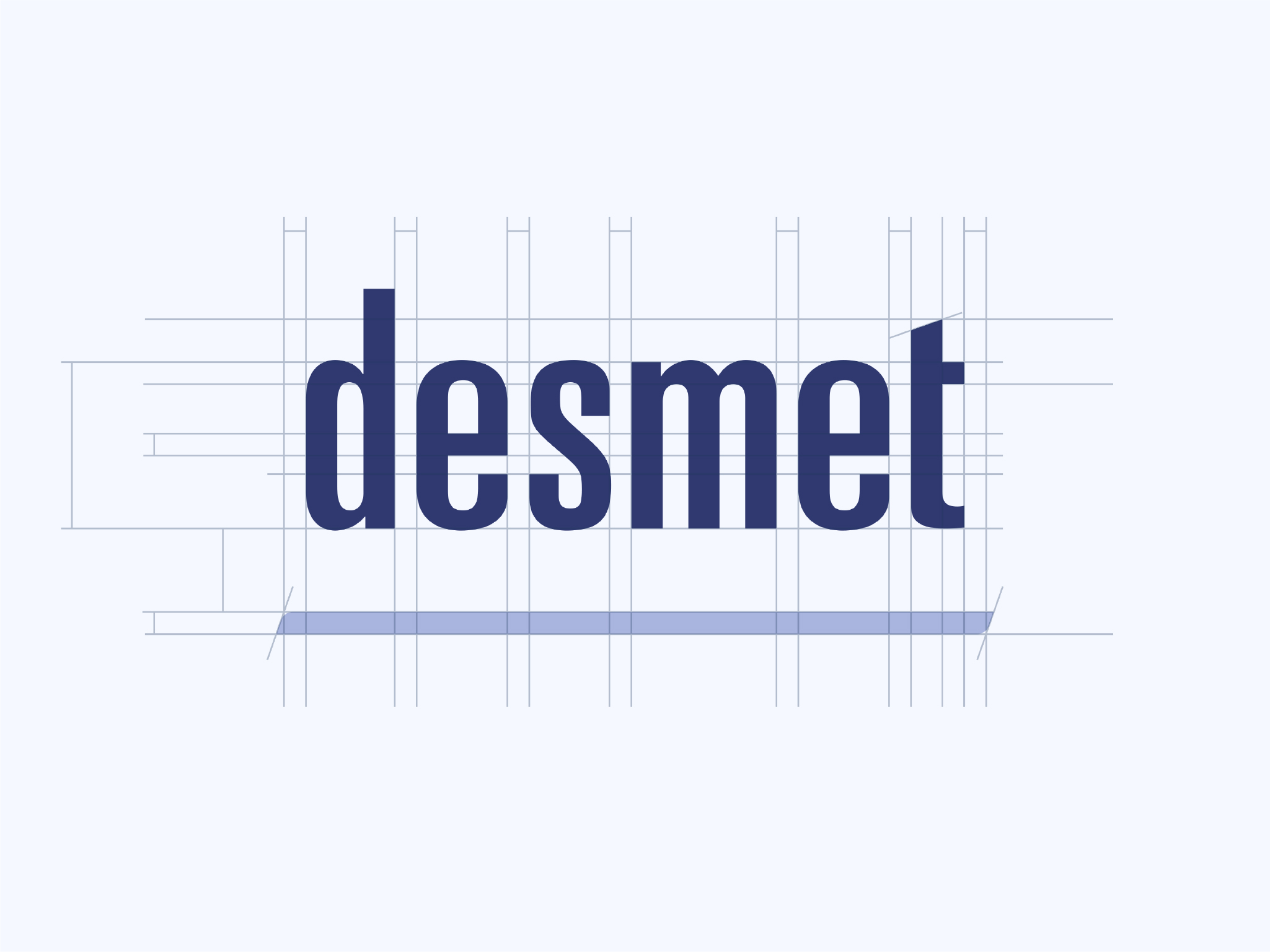
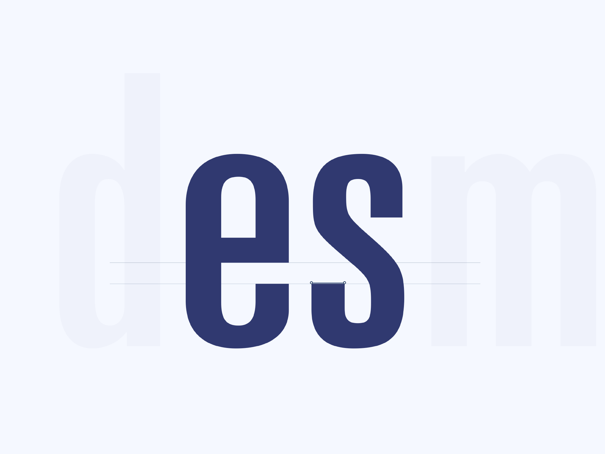
Uma nova escolha cromática com um typeface manipulado reforça o posicionamento da marca. A Desmet apresenta-se agora com uma marca mais sólida e mais consistente – representando as diferentes áreas de negócio mais alinhadas com a marca.
Desmet’s brand positioning has been improved with a new colour scheme and modified typeface. This has resulted in a more unified and consistent representation of the business across its various areas.